Managing and Configuring Experiences
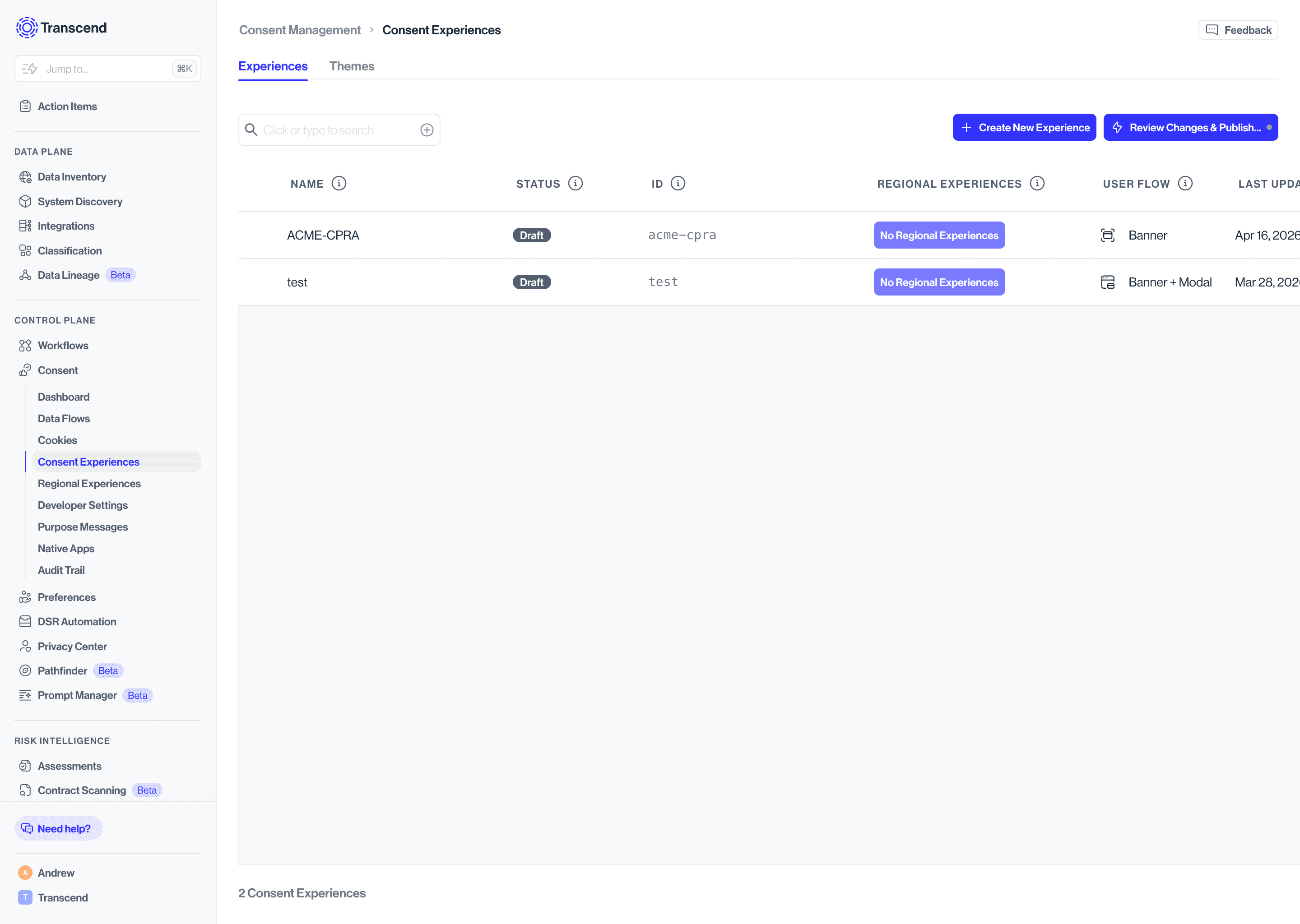
Go to Consent Management > Consent Experiences to see all your consent experiences. Each row in the table shows:
- Name - The display name of your experience
- Status - One of three states:
- Draft - Work in progress. Cannot be assigned to a Regional Experience and will not be included in your next publish.
- Active - Finalized and staged for your next deploy. Available to assign to a Regional Experience. Any edits will move it back to Draft.
- Published - Deployed to production and live for end users.
- ID - A unique slug identifier (e.g.,
gdpr-consent) - Regional Experiences - Which regional rules this experience is assigned to
- User Flow - Whether the experience is configured as Banner only, Modal only, or Banner + Modal
- Last Updated - Timestamp of the most recent change
You can duplicate or delete any experience using the icons on the right side of each row.
- Click + Create New Experience. A three-step wizard will guide you through setup.
- Select a template
Choose a starting point from the dropdown:
- No template, I want to design my own interface - Start from a blank canvas
- GDPR, CPRA, LGPD, nFADP - Start with one of the pre-configured privacy-compliant setups.
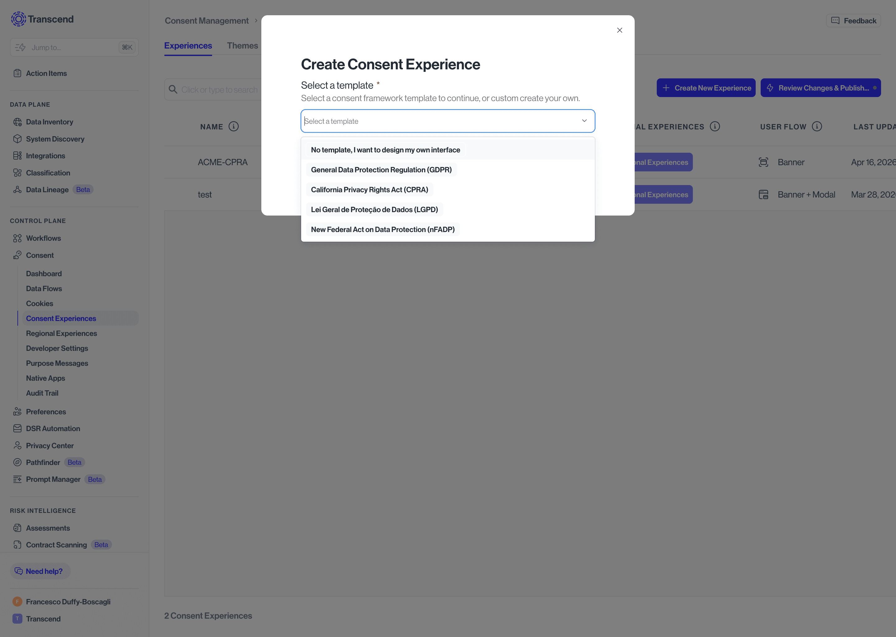
Templates give you a compliant head start but are fully customizable. If you're launching for EU visitors, the GDPR template is the fastest path to go-live.
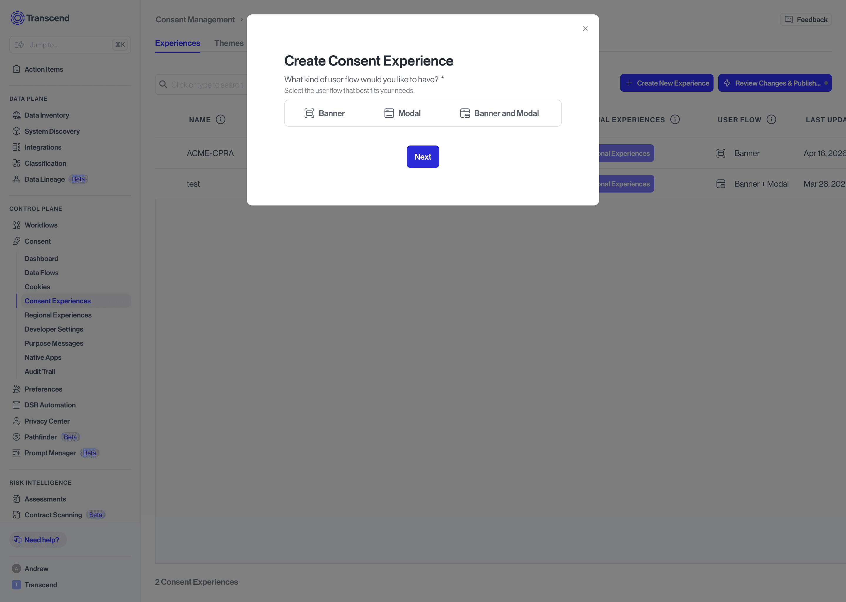
Choose the UI layers your experience will include:
- Banner - A first-layer banner only. Best for simple opt-out or disclosure use cases.
- Modal - A second-layer modal only. Best when you want to surface granular purpose controls without a preceding banner.
- Banner and Modal - A two-layer experience. The most common setup for GDPR and similar frameworks.
- Experience Name - A display name for your reference. This can be changed later.
- Experience ID - A unique slug identifier. ⚠️ This cannot be changed after creation, so choose carefully.
- Supported Languages - All languages this experience will need to support.
- Default Language - The language shown when no other language match is detected.
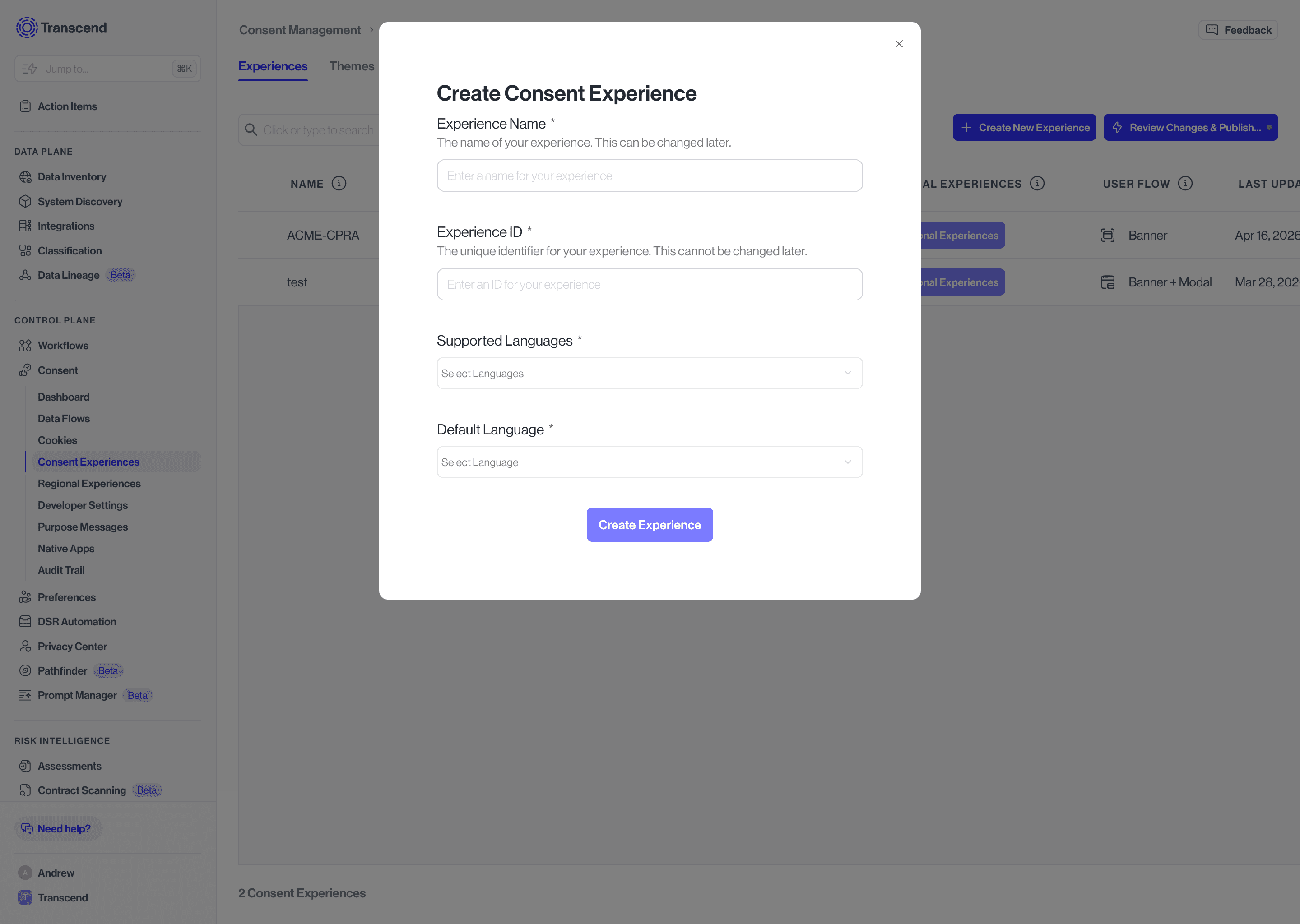
Click Create Experience to finish. Your new experience will open in the editor in Draft state.
The editor opens in a read-only preview by default. Click Edit Experience in the top right to make changes. The editor uses a split-screen layout — live preview on the left, configuration panel on the right.
Use the Layer toggle to switch between the Banner and Modal, the Locale selector to preview in different languages, and the Theme dropdown to preview your experience with a specific theme applied.
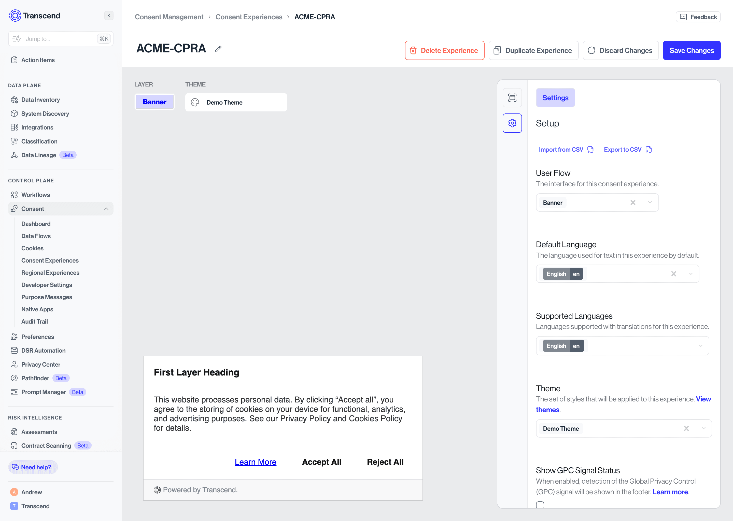
The right-hand panel shows a summary of your experience: Name, ID, Internal Description, Regional Experiences assigned, supported Languages, and Last Updated details. Click the pencil icon next to Internal Description to add notes for your team.
When you're ready to stage the experience for publishing, click Set Active Status to move it from Draft to Active.
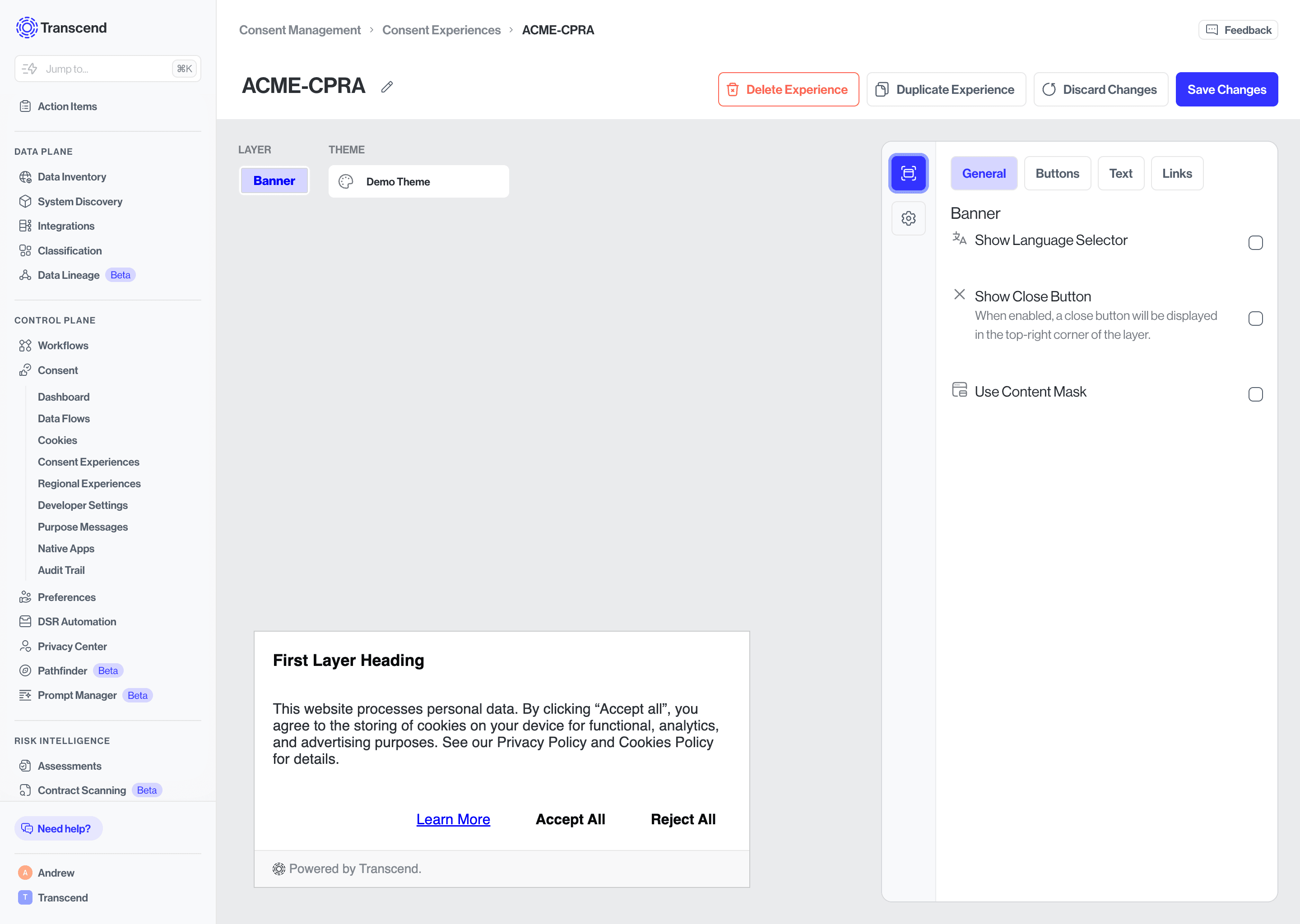
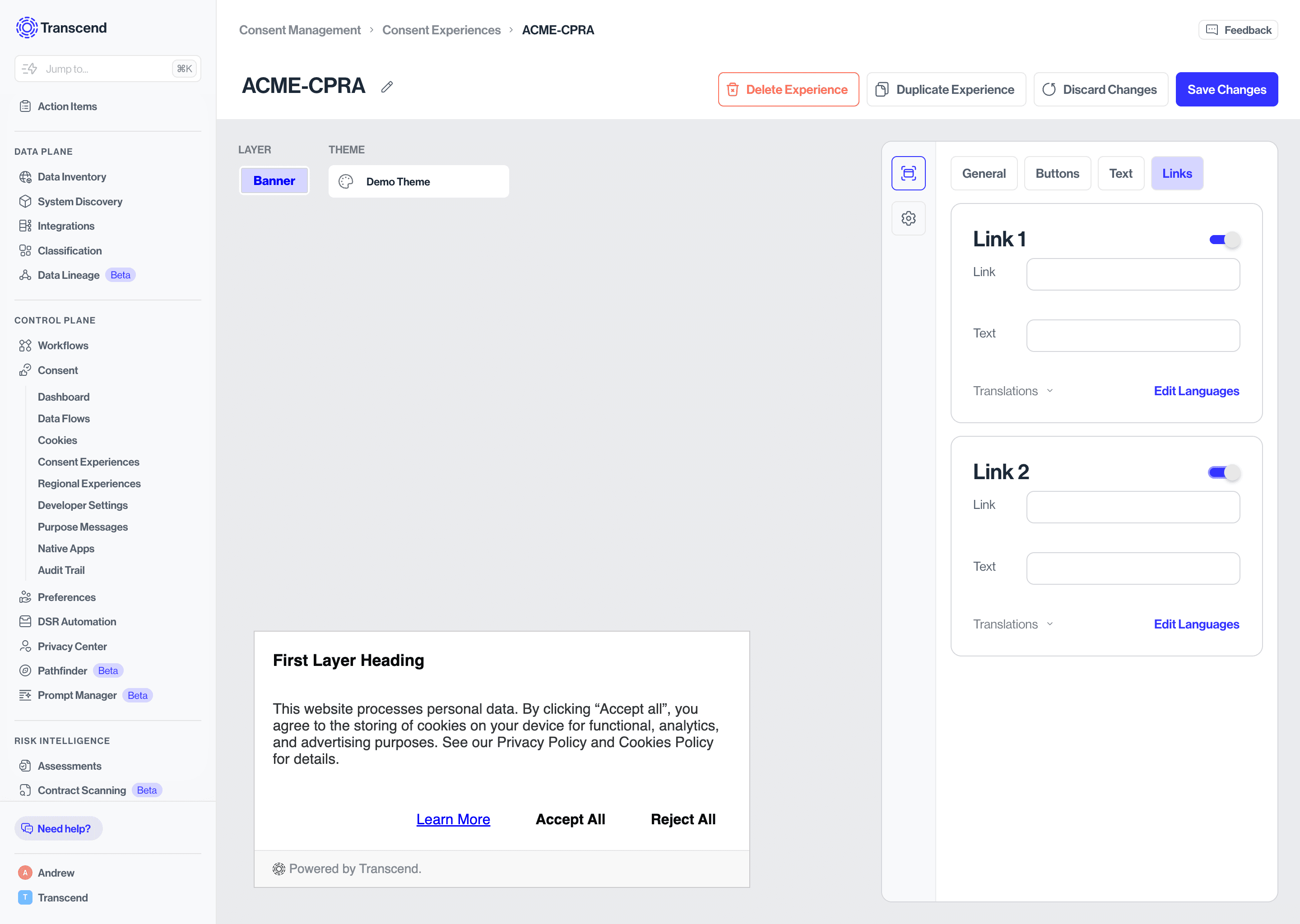
The configuration panel has four tabs, General, Buttons, Text, and Links, for both the Banner and Modal layers.
Button, Text, and Link visual styling is controlled at the Theme level, not in the experience editor. Go to Consent Experiences > Theme to adjust styling.
General controls overall banner behavior: language selector visibility, close (X) button visibility, and content mask (a background overlay that prevents interaction with page content behind the banner).
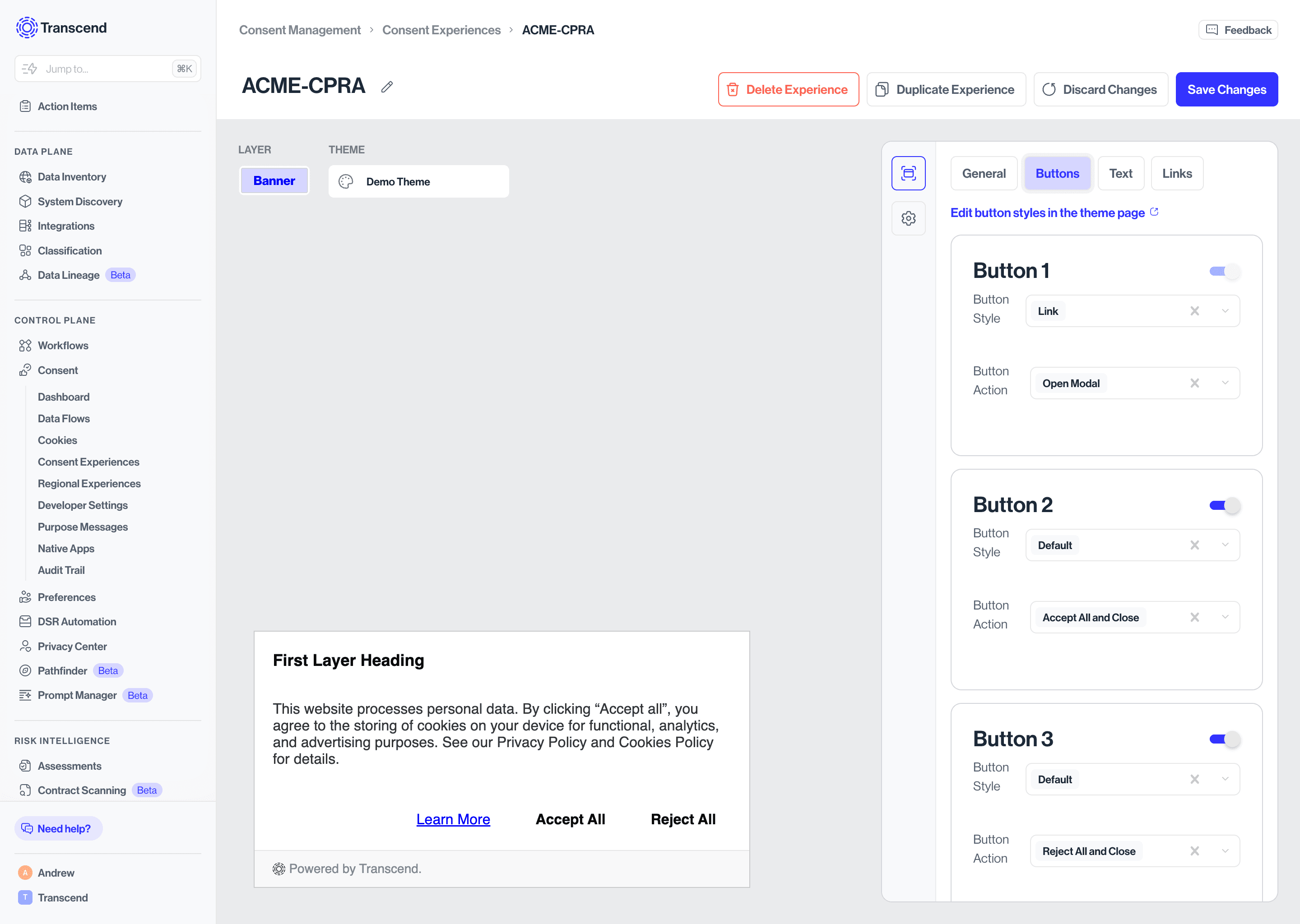
Buttons configures up to three buttons, each independently toggled on or off. For each button, set a Button Style (Default or Link) and a Button Action: Open Modal, Accept All and Close, Reject All and Close, or Save preferences and Close.
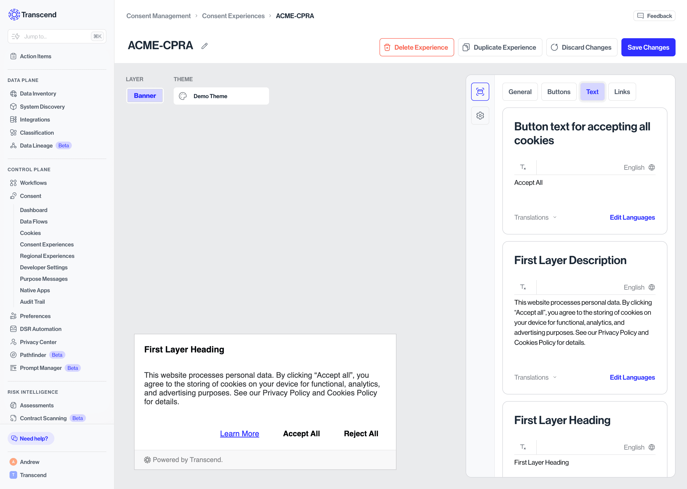
Text is where you edit all text on the banner - heading, body description, button labels, GPC detected message, and footer link text. Every field supports translations via Edit Languages.
Links configures up to two footer links (Link 1 and Link 2), each with a URL and display text. Typically used for Privacy Policy and Cookie Policy links. Each supports translations via Edit Languages.
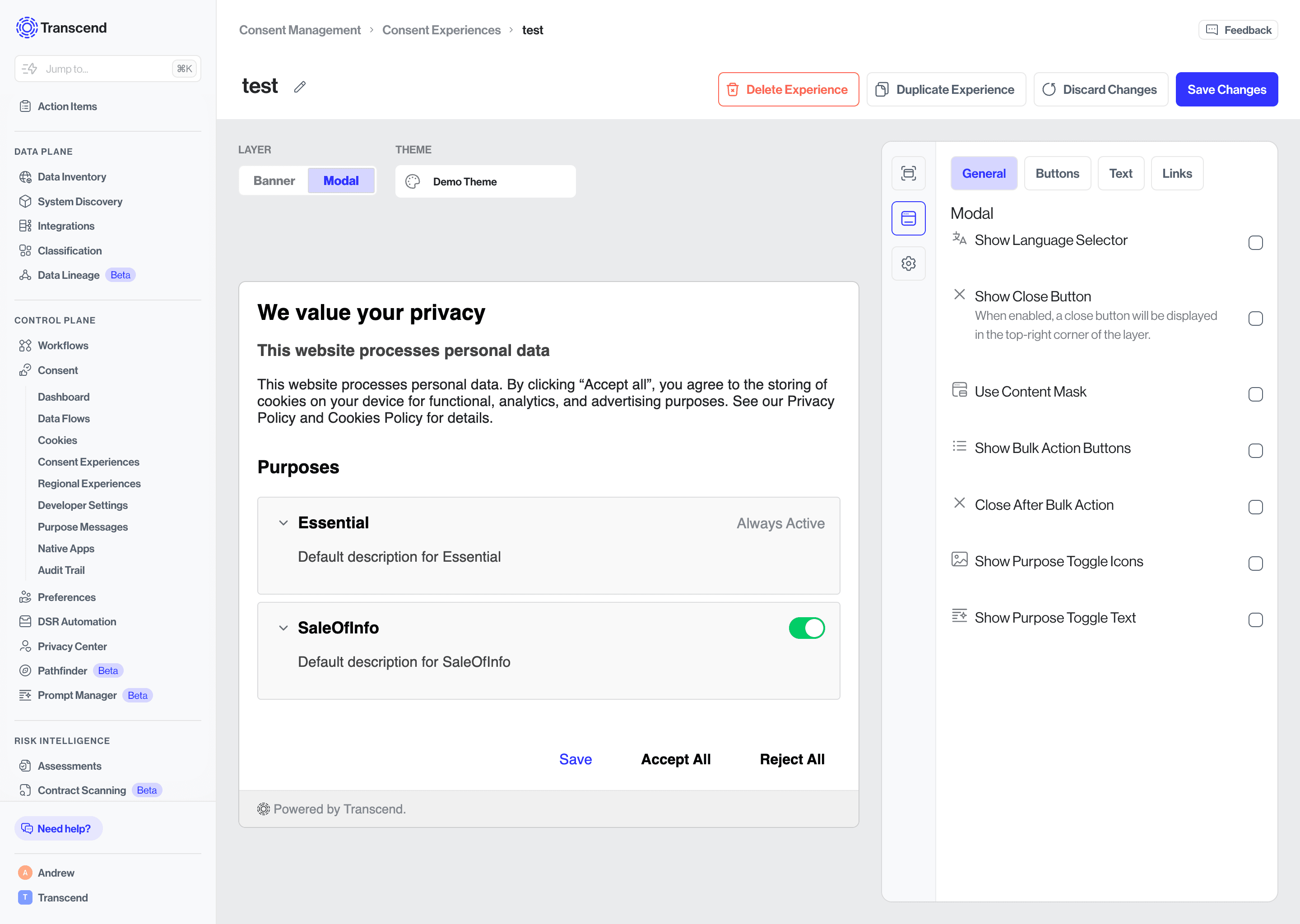
The Modal uses the same four tabs as the Banner with some additional controls.
General includes the same language selector, close button, and content mask options, plus: Show Bulk Action Buttons (adds Select All / Deselect All above the purposes list), Close After Bulk Action (auto-closes the modal after a bulk action), Show Purpose Toggle Icons, and Show Purpose Toggle Text.
Buttons works the same as the banner, up to three buttons with configurable style and action. Save and Close is a common action for modals, letting users save granular purpose selections before dismissing.
Text includes all banner text fields plus modal-specific fields: Title, Subtitle, Description, Title for the purposes section, Label for enabled toggle state (e.g. "Enabled"), Label for disabled toggle state (e.g. "Disabled"), and Label for partially enabled toggle state (e.g. "Partially Enabled"). All fields support translations via Edit Languages.
Links works identically to the banner — two configurable footer links with URL, display text, and translation support.