Managing and Configuring Theme
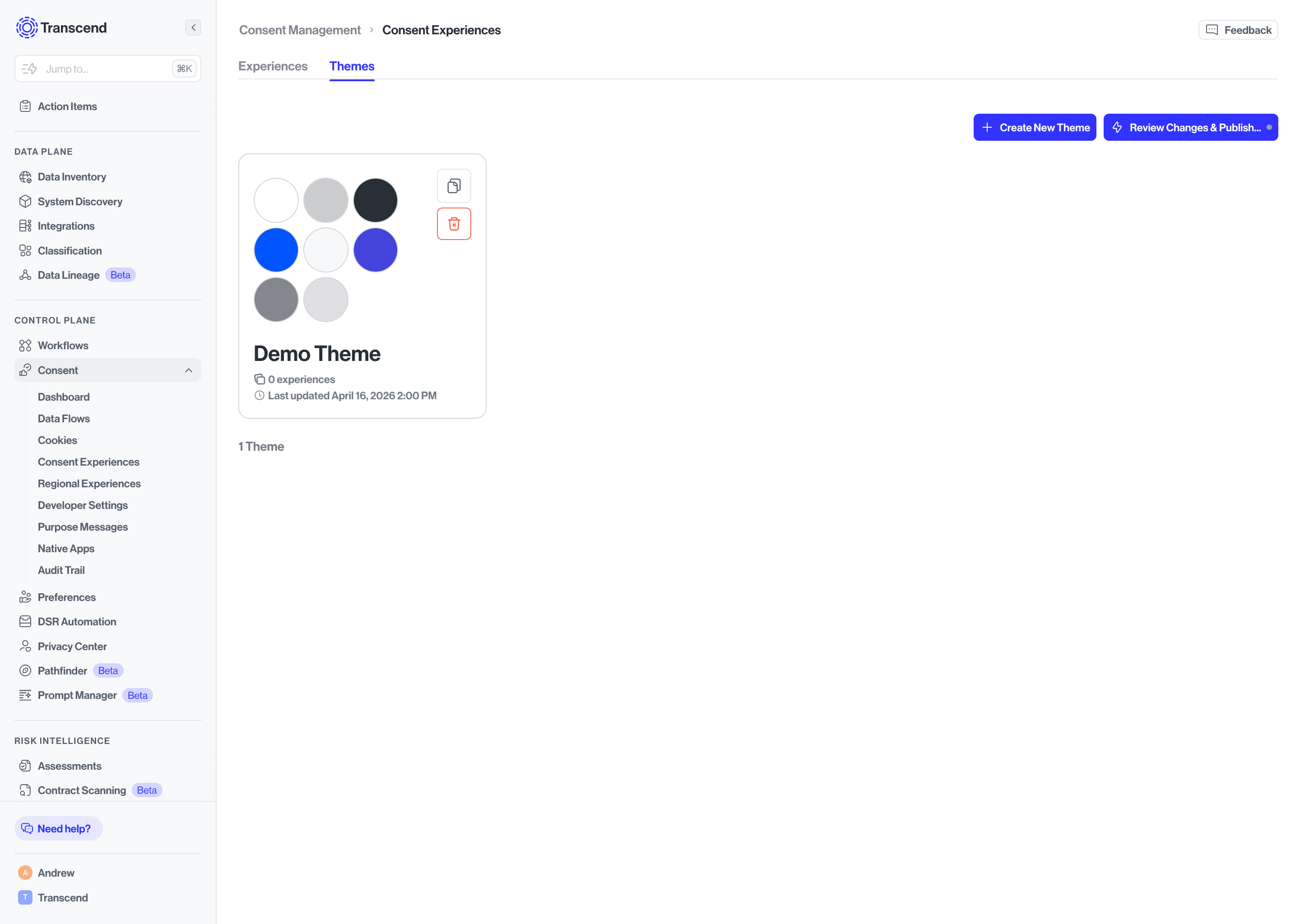
Click the Themes tab on the Consent Experiences page to see all your themes. Themes are displayed as cards showing a color palette preview, how many experiences are using the theme, and when it was last updated. You can duplicate or delete any theme using the icons on each card.
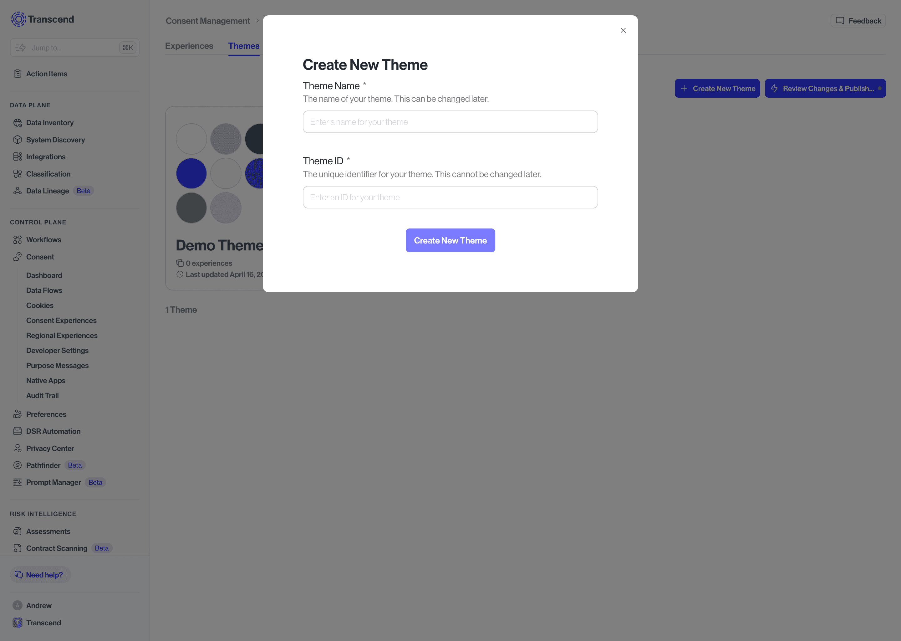
- Click + Create New Theme.
- Fill in two required fields:
- Theme Name - A display name for your reference. This can be changed later.
- Theme ID - A unique identifier for your theme. ⚠️ This cannot be changed after creation, so choose carefully.
- Click Create New Theme to open the Theme Editor.
Create your theme before building experiences. Any experience you create can instantly inherit your brand's colors and styles.
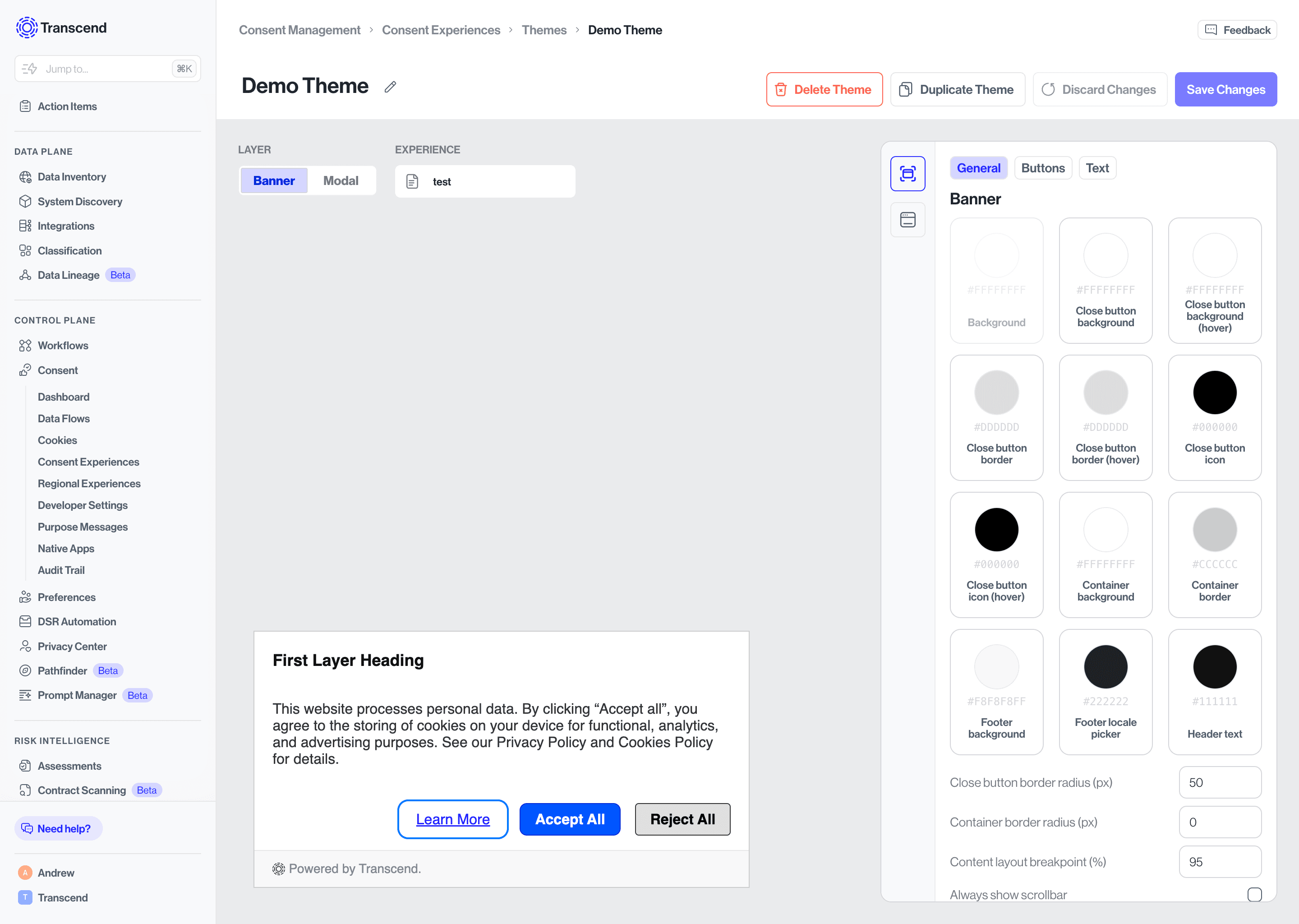
The Theme Editor uses the same split-screen layout as the experience editor. Use the Layer toggle to switch between Banner and Modal, and the Experience picker to preview how your theme looks applied to a specific experience.
The configuration panel has three tabs - General, Buttons, and Text. The Modal layer has the same three tabs with the same configuration options as the Banner.
The General tab controls the structural colors, layout, and positioning of your banner.
Colors - Set the background color of the banner itself, along with the close button's background, border, and icon colors. Each of these also has a hover state so you can control how the button looks when a user moves their cursor over it. You can also set the container's background color and border color separately from the overall banner background.
Banner Position - Choose where the banner appears on the page for your visitors. Options are Bottom full width, Top full width, Center, Bottom left corner, Bottom center, and Bottom right corner. The live preview updates immediately when you switch positions so you can see exactly how it will look.
Border radius - Control the roundness of the close button and the banner container independently, set in pixels. A value of 0 gives sharp corners; higher values give a more rounded appearance.
Content layout breakpoint - Set the pixel width at which the banner layout switches to its mobile-optimized arrangement.
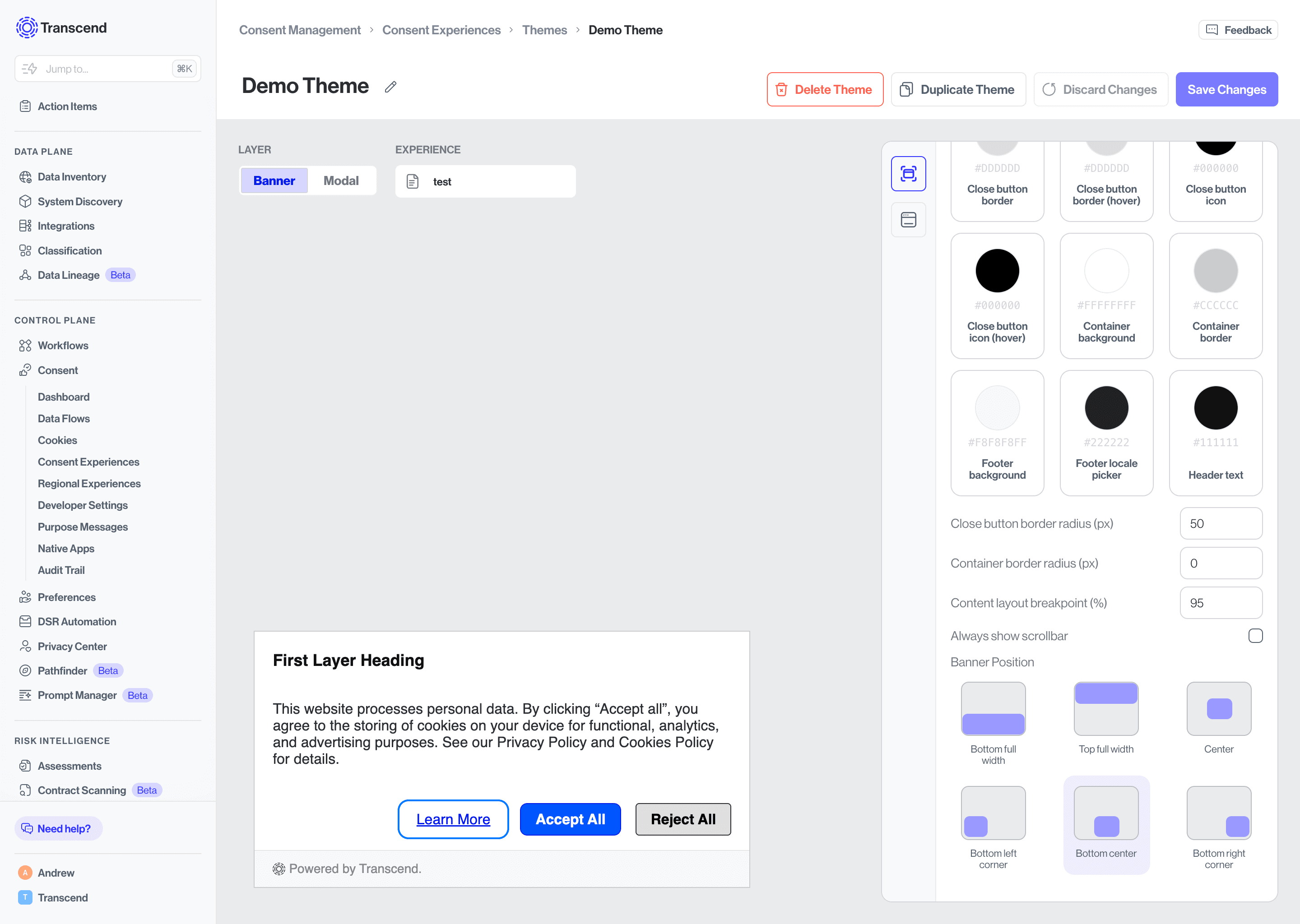
Always show scrollbar - When toggled on, the scrollbar inside the banner is always visible rather than appearing only when content overflows. Useful for longer disclosure banners where users may not realize there is more content to scroll through.
Logo - Upload your brand logo to display it inside the banner. Click the upload area to select your file.
The Buttons tab lets you style each button type independently, giving you full control over how each button looks in its default and hover states.
Primary Default Button - This is the main filled button style, typically used for your most prominent action (e.g. Accept All). You can set the background color, background hover color, border color, border hover color, text color, text hover color, and border radius independently.
Primary Link Button - A text-only button style with no background or border, used when you want a less prominent primary action. Set the link text color and link text hover color.
Secondary Default Button - A filled button style for your secondary action (e.g. Reject All). Supports the same color and border radius options as the Primary Default Button.
Secondary Link Button - A text-only button style for secondary actions. Set the link text color and link text hover color.
The Text tab controls the color of every text and link element that appears in the banner.
Cookie and privacy policy link - The color of the Privacy Policy and Cookie Policy footer links.
Description link - The color of any hyperlinks embedded within your banner's body description text.
Description text - The color of the main body copy in your banner.
Powered by Transcend link - The color of the Transcend badge link displayed in the banner footer, if enabled.
Underline footer links - When toggled on, footer links (Privacy Policy, Cookie Policy) will display with an underline. Toggle off for a cleaner look.
Underline links in body text - When toggled on, any hyperlinks within the banner description will be underlined. This is on by default and recommended for accessibility.
When you're done configuring each tab, click Save Changes in the top right.
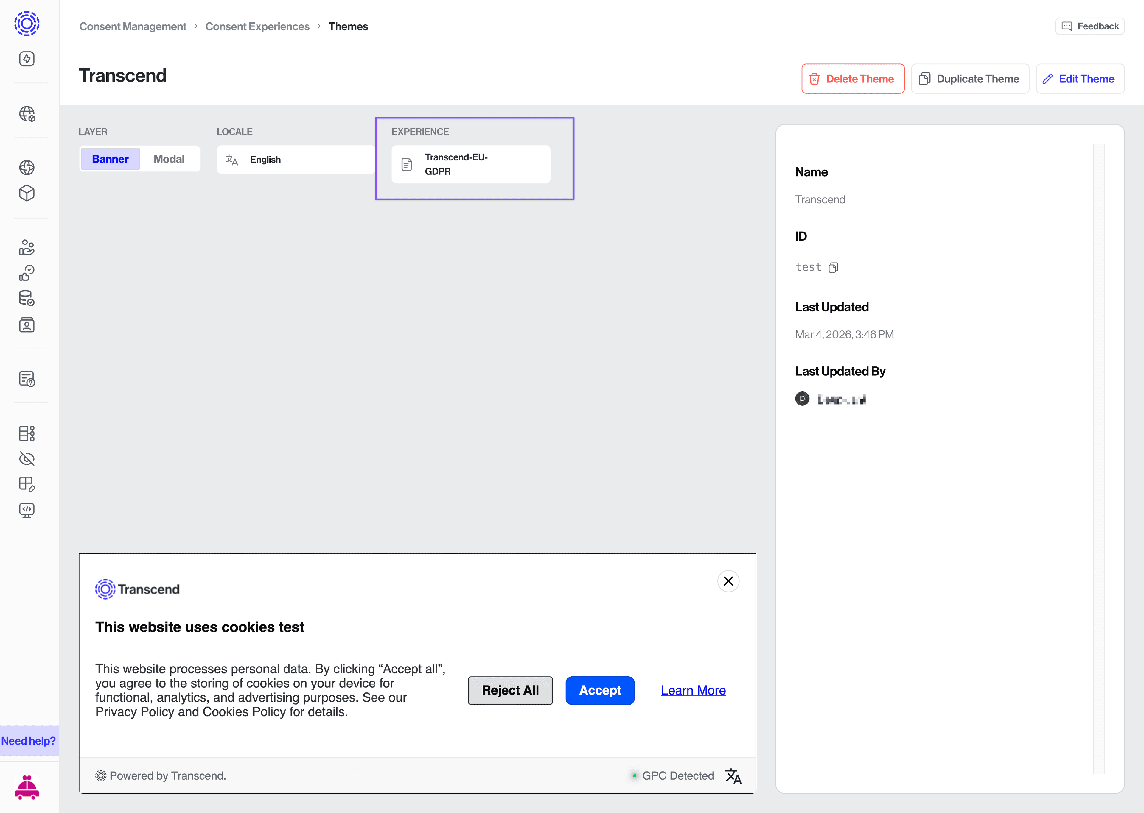
You can apply a theme to an experience in two ways.
- Go to the Themes tab and open your theme.
- Click the Experience dropdown at the top of the preview area.
- Select your experience from the list. The live preview updates immediately.
- Click Save Changes to confirm.
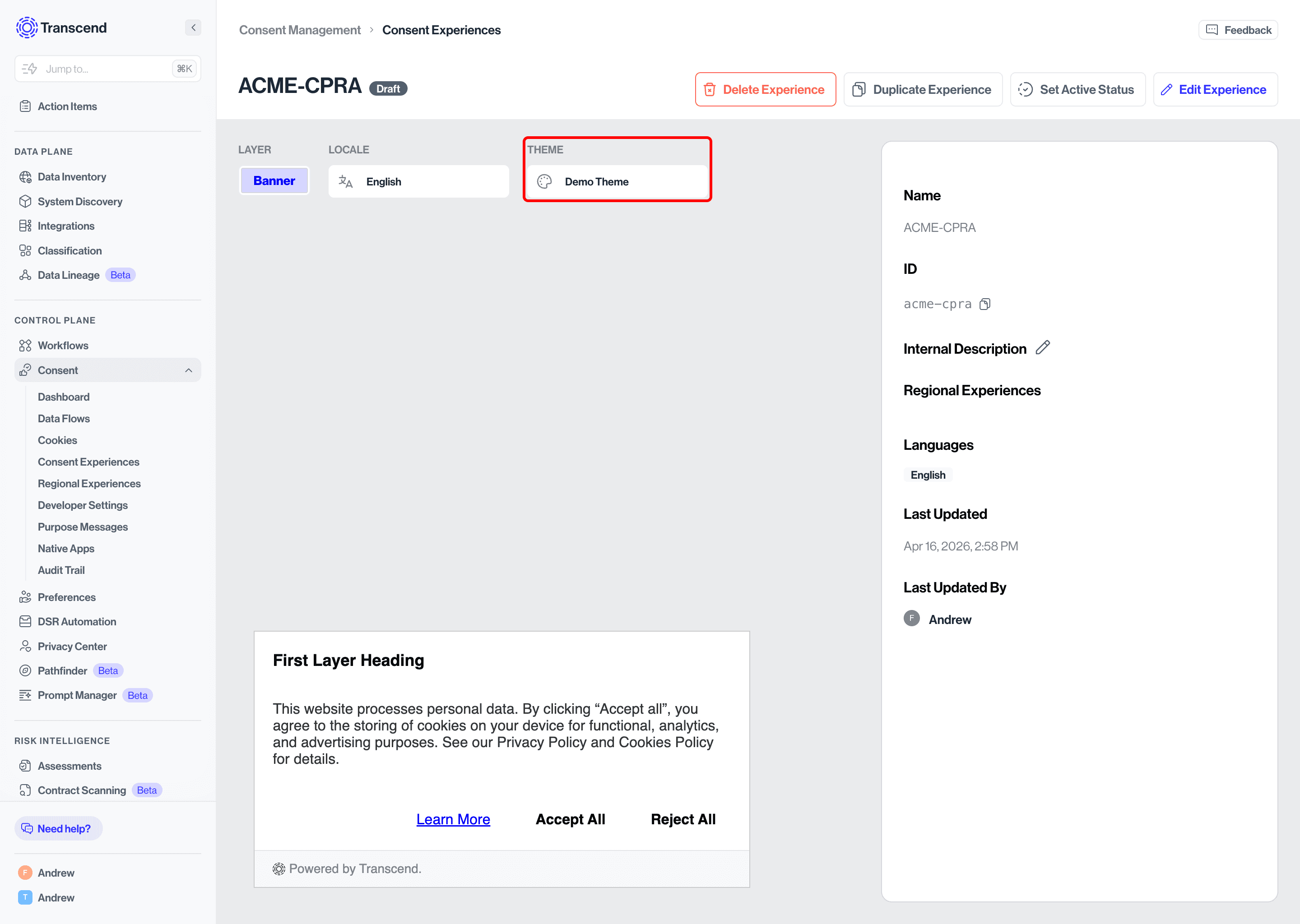
- Go to the Experiences tab and open your experience.
- Click the Theme dropdown at the top of the preview area.
- Select your theme from the list. The live preview updates immediately.
- Click Save Changes to confirm.